You’ve heard about it before. Third party validation. Digital marketing landing pages have this logo belt galore. Yet, how many times have you been able to click on the logo and it take you to a meaningful case study?
In this article, I’m going to write about some secondary research I conducted using an ethnographic research method known as “casual observation.”
Specifically, I’ll be showing examples of this new trend of left side column logo navigation that has taken effect. Really, it’s only been possible to do such a thing now that designers and developers started realize the wasted space of landscape oriented screens, in what was once dubbed the gutters.
This column layout is not new, but the way these companies are using them is interesting.
Ethnographic Research

I noticed it with the recent YouTube redesign. Once my subscriptions hit the left hand side. Now, this is not the best implementation of this UI, but it made an interesting note in my mind.
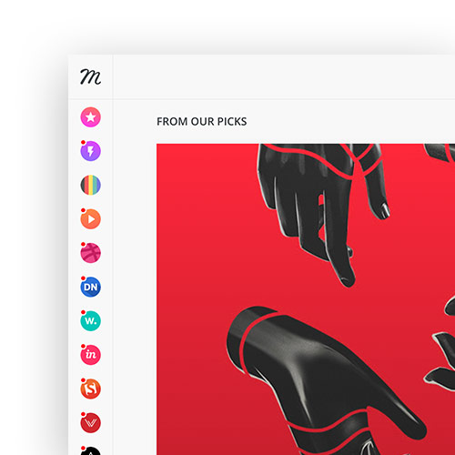
The next place I saw this was Muz.li. Muzli, is an Invision offspring that helps designers find inspiration. All of the designer resources you subscribe to go in the far left column sidebar in their “favicon” logo identity.
There are far subtler implementations of this. Especially when developers minds can’t think in fluid design and force the layout to have breaking points. Breaking points are these fixed width layouts based upon media queries. Instead of using percentages for the widths of divs, they have to rely on fixed width containers at certain junctures. Don’t worry, they’ll eventually take the brave step into “content is water” territory, and understand that the screen width is the width of the container. Nevertheless, we press on…
Glassdoor has the logos listed on the left column in their listing.

Indeed does something similar.
Riipen’s app, also lists them very similar to Glassdoor.

And so the trend continues.
Third Party Validation
It makes some since when you think about the uselessness of third party validation in the past. Those logos from big name brands in a single file horizontal line across a page like a belt. Users are the wiser these days. If you view a heat map of said landing pages, you’ll likely find some people click the logos themselves, even though they go no where. Some more in-depth companies might send their audience to a corresponding case study, but in this day and age, more people whether B2B or B2C are expecting your product or service to be completely digital and accessible online. Hence why Muzli, Youtube, and Glassdoor have big name brand logos on the left hand side.
Ergonomics of Reading
The F grid is very important in the behavioral reading patterns of the wester civilization. Putting third party validation in the staff of the “F” grid makes a lot of sense, because you know it will get seen.
What’s important to note here, is to avoid putting logos in the left column just for show, they need to be clickable. At least to a case study.
My favorite implementation of this would likely be that of Yelp. You see, Yelp sort of crowdsources your business onto its platform whether you like it or not. I believe angel.co does something similar.
What happens when a decision maker from a company finally visits their public profile on said platform?
The decision maker or business owner can claim their page, take ownership of it, prove it’s in fact their company, and go through on-boarding process of the platform.
Why is this important?
Just think for a second as a startup. Let’s say, you’re a multi-sided marketplace, and you have to prove your worth by raising enough revenue to higher awesome people and grow or scale your company. What better way to inflate one side of your marketplace to prove your business model!
Let’s take crowdsourcing platforms for example. On one side of the marketplace you have companies that have grown stagnate and need innovation to reinvigorate their brand’s value proposition. On the other side you have students and retirees, often overlooked in the archaic job application process for lack of experience or its been a while since they’ve been privy to some of the new tech out there. Yet, that doesn’t mean their inept. In fact, many of these individuals are quite talented folks. Demographics no longer matter. It’s actually their talent that can catapult them or leap frog them over competition. This is perhaps the fun factor of crowdsourcing platforms.
Problem
The problem for a startup is that their money comes from at least one of the user personas in their multi sided marketplace. Which side has the most money in our diagram? Why, it’s the companies of course. How do you get big name brands like Coca Cola, Nike, and BMW on your platform? Well, you build their profiles for them, and put a “claim this business” on the page.
This tactic requires the ability for a web developer to scrape the internet of things to artificially inflate one side of the marketplace. Once you’ve successfully worked out a regime for doing so, you can focus on increasing acquisition for the other side. The student/retiree side.
This enables you to think solely about the value proposition for only one user persona, because you’ve already inflated the other side.
AirBNB did this too. They inflated the host side of their marketplace so that they could incentivize more guests to stay.
Uber did this too, in a famous napkin sketch, they outline how to juggle inflating each side of the market place little by little to balance things out.
Now, if we look at Slack, Atlasssian, and many other applications out there, we’ll eventually see their user interfaces port over to marketing landing pages, as product marketing takes over marketing in advertising.


Leave a Reply